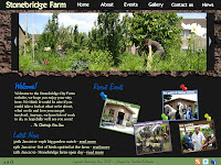
Here is my final developed design. I've tried to encompass everything I liked about my basic ideas into one super idea. I like it and I think it's accomplish-able. Although I'm still on the fence about what colour scheme to use. I'm also uncertain about where ''Stonebridge City Farm'' should go. Should it go on the navbar and push the links to the right, or should it stay on the image and allow the links to be centered. I think it's more consistent if I move it to the navbar as things like the facebook and twitter links can occupy the bottom bar and stop it from looking empty. It also makes sense considering that most website follow this formula, therefore avoiding confusion for the user.
I've taken bits and bobs from existing websites as well, for example the navbar features at the very top of the page, much like the facebook navigation, which leaves me more room to be a little bit more creative with the layout and in my opinion, makes the layout more fluid and accessible. I've also included an accessibility option for users that may find the text too small to read. Instead of shoving the pinned up items further right and messing up the layout, the columns the text is in will simply be forced downwards as at the moment the maximum amount of space is being occupied and creating more space won't affect the design as negatively.
The usage of real-life textures as a background is something I carried across from this design:
As you can see I used a wood texture for the background of the title, I think it's add extra variety instead of using gradients or solid colours all the time. You could also say that I've taken the idea of having the image in the top half of the page has carried across, although I've used that in most of my ideas and as I explained before, I believe it breaks up the page and makes it appear less formal as there is a greater absence of text. Additionally I used real life photography to my advantage in a different design (see below) and thought it worked well, thus re-enforcing the use of it in my developed design.
I've opted against using graphics art to liven the page up, although I may use it on other pages where i feel it it neccessary. For the time being however, the home page doesn't require it as it's currently filled with elements that are actually useful to the user. Also I've gone with the idea that the header doesn't have to take up a large section of the page, after-all, if someone has
sought out the Stonebridge website, chances are they don't need reminding of where they are. Which is another reason why i chose to move the 'Stonebridge farm' to the top right as that is usually where the site name is on websites that use the same principle.
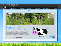
I've also taken into consideration my research. I've tried to incorporate blues, greens and browns. I found that the green was a little harder to utilise as it doesn't contrast well with blue. I know this because I tried using a blue background with green text and there was a noticeable difference in how hard the text was to read because of this. Which is another reason why I think the contrast between cream and grey works well. For readabilitys sake, cream background with grey text works well, even though I prefer it the other way around. Additionally I had trouble figuring out a suitable colour for the bottom navbar. That shade of green was the most suited, however I think it looks out of place and that there are better options in terms of where the colours are used.
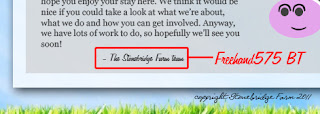
As far as fonts go, I've stuck to 'Georgia' as it is easily readable and comes as standard on windows computers, I also think it adds extra depth to the design. Verdana is usually too wide and trebuchet is usually used quite often. Helvetica is over-used and not to mention not everyone has it. Georgia ticks all the boxes. It's easy to read, looks good, most computers have it and it causes the least amount of problems in terms of formatting. I have used a custom font for the 'Welcome!', 'Latest New' and 'Recent Events' headers, but this can easily be combatted as I can simply make them images, the same applies for the navbar (Font name can be seen above which was used briefly in one of my later ideas, I thought it looked nice so I decided to experiment and it worked. The handwritten effect gives a more personal feel in my eyes). The fonts I used for the navbar was similar to one I used in a previous design however in used elongated descenders on some of the glyphs(see below), which I didn't feel worked well with the rest of my developed design. So I chose a similar looking font minus the italics and the aforementioned elongated glyphs, and so Aardvark Cafe became Elegance.

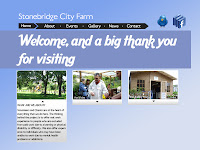
Finally, I've also taken the idea of creating 'boxes' that feature a stripped down version of the site's content and are clickable to the appropriate page. This idea was taken from the idea above, however given the available space I couldn't incorporate the drop down description. Although perhaps I could make it so that when it is hovered over, the other boxes become transparent and the selected box expand for a brief description. I'd like to include this as it would be a nice flash element to the website. Two other things I took from my ideas was the continuation of featuring the 'latest news' element on the home page and the small header and site name, which I first used in the idea below.
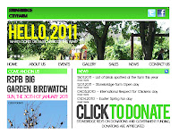
Overall I am happy with how my design has come out. It may not look as professional as some websites out there but I believe it is infinitely better than the current website that is currently being used, and therefore is an improvement. I am aware that I will have to look in to php for things such as the rss feed and the new updates...although this is very simple stuff once I can get a grasp on it. Depending on how much time I have I may include the function to sign up for a newsletter. Although we will have to wait and see


No comments:
Post a Comment