Showing posts with label Client Project. Show all posts

Sunday, 17 April 2011

Client Project - Update 3


So here is what my homepage currently looks like. As you can see, it's not exactly how I initially designed it, and there is a good reason for this.

I've decided that given the timescale I have to build the other pages as well as the flash that needs to be embedded and coded, that it would be a better idea to produce a basic version of each element beforehand that focuses on function rather than appearance.

So far I've implemented the basic flash banner that sits below the navigation. I spent a long time messing around with many tutorials that either didn't work or were for AS2 instead of AS3. In the end I opted to not use Actionscript as that would only be required for a banner that has the option of the user choosing which picture they like, the basic version being just some images and some simple fades. I think still works just as well, however it is obviously less difficult to make and that therefore mean less credit, so I think once I have built the basic version of the site, this will be first element that I will advance.

I've also added a basic twitter feed which I also had to spend a lot of time fixing. After following a tutorial that ultimately ended up working, except for problem:

The feed is made up of three images. The top image, which includes the ''Recent Tweets'' header and the top of the speech bubble, a middle image of a 1px strip that is repeated as to accomodate any size tweet and a bottom image that comprises of the bottom of the speech bubble. Because of some formattig issues with the margins, this error occured. Although after much searching, I found the code to recitify this problem and close the gap.

''* {
                 margin: 0;
                   padding: 0;
  }
''

By placing this code at the top of my css document, the formatting was reset to default.

Apart from the usual issues with wrappers and positioning that css seems to bring, there have been few other problems and progress has been relatively smooth apart from the banner issue and the margin issue.


I had to make some changes to the design to accomodate users that may not have a wide/larger resolution. Initially I planned to have the dirt background for banner extend across the users screen, no matter what resolution. The same would have applied for the navbar. I decided against this for a few reasons:
  1. Users with a wider resolution may suffer from longer loading times due the fact that they would be required to download a larger image for the dirt background. Obviously this affects accessibility as research has shown that websites with slower load times are generally less likely to hold the users attention. 
  2. Another problem for users with wide resolutions is that the logos on the right-hand side of the navigation as well as the size alteration buttons on the opposite side, would leave large empty spaces either side of the content, making the website looking incomplete and unprofessional. 
  3. I opted for a recent tweets as opposed to recent news. Again, this is the more basic element of an original piece of php. It does have it's benefits, one being that it's more secure as the login is based on a server with tighter coding (twiiter.com), it hold greater aesthetic value and also that it requires less coding for effectively the same effect. However, only one tweet can be shown at any given time, to view other tweets the user would have to click the hyperlink embedded within the recent tweets element.
I have also decided that an rss feed would be quite useless, as rss feed generally are used for websites that contain topical information. Many rss feeds that I have looked at on a range of websites encorporate links to other pages that feature related information or an article. While this could incorporated, I don't believe it's 100% neccessary. When I finally go to take pictures of the farm itself I will ask their opinion whether or not it would something they would have interested in/found useful. 

Currently, as the basic version goes, the rss will not be featured. 

Things to do:
  • Gather content for other pages.
  • Build Recent Events element, footer and text size alteration feature.
  • Modify dirt background to emulate developed design.
  • Code flash image gallery 
UPDATE:

I've inserted the text size alteration buttons, but am having trouble actually getting it to work. It could be a number of things. 

 I think It may have something to do with the banner, as the code is all correct and works in it's own document. The <script src> isn't meant to be there for text size alteration. It should  just be <script type='text/javascript>. To try and amend this I will duplicate index.html and remove the banner from one of the copies and alter the script and see if that makes a difference.

It could also be because the text itself isn't within the same wrapper as the javascript. I'm not sure how to get around this as usually the javascript is contained within the <head> tags, as opposed to the <body> along with all the other <divs>. As you can see, the bit highlighted in red is the corresponding tag given to the text to associate with the javascript. However this doesn't work.

I've also inserted the footer and some basic images for the recent events that will take the use to the events page. This took a lot longer than I anticipated, mainly because of formatting issues with the whole website being 200px to right for some reason, apparently it was something to do with the way I had coded the navigation. Initially the fb and twitter logos were in there own div which was wrapped in the navigation div, which was wrapped in a header gif to hold it all together. I removed the fb and twitter divs as well as the header which just left me with a navigation wrapper that is 1024px wide. I then had to insert two buffers either side of the linked pictures to make sure it all adds up and everything is where it should be. 

UPDATE 2: Text size alteration and the banner now work without conflict. Turns out that all I needed to do was insert the javascript just above the <p id='content'>. I initially feared that I could not have both as I moved the <script src='Scripts/AC_RunActiveContent.js" to within the <imagescroller> id and the size alteration worked, but the banner did not. 

That's all fixed now. One thing I should mention, is that instead of increasing the text size to set amounts (i.e. 12px, 18px, 22px and so on) the script simply multiplies the size by 0.2 or vice versa each time a button clicked. This allows for greater flexibility as the set sizes may not accomodate everyone and faster loads times thank to the reduced amount of code required. Here's a screenshot of it in action:

    Text size after 2 clicks from default.


    Text size after 4 clicks from default.


    So as you can see it works well, there is one small snag though. After increasing the text 4 times the entire wrapper shifts around 5-10px to the right, but doesn't move again no matter how much the text is increased. I have no idea what causes this and if I have time i'll fix it. However it's not the biggest priority.


    Monday, 4 April 2011

    Client Project Update 2

    As part of the design, I was going to allow the owners of the Stonebridge farm to post tweets as news updates that would feature on the homepage. So far it looks like this:

    The way this tweet is made, is that the top section (anything above the text), is a static image placed on the page using css and html. The same applies for everything below the text, as that is another section of the speech bubble that has been split up. The section in the middle is a 1pixel wide slice of the PNG file I made in photoshop, that has been assigned as a background-image in css, and then repeated within a wrapper defined in the stylesheet to stop the repeating image over-flowing.

    The image above is a direct screenshot from firefox. As you can see, I have a gap between the top section and the repeating middle section. Which i need to get fixed. I've also decided to change the overall layout of the chosen design, purely because I hadn't thought through what the website would look like to users with a resolution bigger than 1024x768, which is the optimal resolution to view the website with.

    Instead of the dirt background stretching as far as the page is wide, everything will be set in a box and the dirt background will be cut off, a long with the previously extending navigation bar and footer. This means I will have to chose an appropriate colour for the background, as I would like it so that the contents background isn't the same as the site's background.

    Currently downloading Adobe Flash, and will proceed with producing the imageviewers and map once it's installed. I also need to gather content, such as taking photo's and statements from people who work at the farm, this can be done when I am back in Nottingham.

    Friday, 1 April 2011

    Client Project Update

    Just going to quickly document what I've done, or what I've attempted rather. Will update in more detail tomorrow.

    Basically made the images for the navbar, both for when you hover over them and vice versa. Centred them. Also found a temporary image for the dirt background and a good flash tutorial for the image viewer.


    It's been a while so this is a long process. I currently need to make the dirt background for the image viewer. I think instead of having the dirt stretching across the page indefinitely, I'm going to box it off and only make the navbar appear that way using background-repeat. I think it'll make it look more polished.

    Will update with images tomorrow!

    p.s. oh and I've also created each page file and found a good flash tutorial for an image viewer to go on the gallery page.

    Sunday, 20 February 2011

    Developed Client Ideas - Evaluation and Decisions Explained


    Here is my final developed design. I've tried to encompass everything I liked about my basic ideas into one super idea. I like it and I think it's accomplish-able. Although I'm still on the fence about what colour scheme to use. I'm also uncertain about where ''Stonebridge City Farm'' should go. Should it go on the navbar and push the links to the right, or should it stay on the image and allow the links to be centered. I think it's more consistent if I move it to the navbar as things like the facebook and twitter links can occupy the bottom bar and stop it from looking empty. It also makes sense considering that most website follow this formula, therefore avoiding confusion for the user. 

    I've taken bits and bobs from existing websites as well, for example the navbar features at the very top of the page, much like the facebook navigation, which leaves me more room to be a little bit more creative with the layout and in my opinion, makes the layout more fluid and accessible. I've also included an accessibility option for users that may find the text too small to read. Instead of shoving the pinned up items further right and messing up the layout, the columns the text is in will simply be forced downwards as at the moment the maximum amount of space is being occupied and creating more space won't affect the design as negatively. 

    The usage of real-life textures as a background is something I carried across from this design:


    As you can see I used a wood texture for the background of the title, I think it's add extra variety instead of using gradients or solid colours all the time. You could also say that I've taken the idea of having the image in the top half of the page has carried across, although I've used that in most of my ideas and as I explained before, I believe it breaks up the page and makes it appear less formal as there is a greater absence of text. Additionally I used real life photography to my advantage in a different design (see below) and thought it worked well, thus re-enforcing the use of it in my developed design. 

    I've opted against using graphics art to liven the page up, although I may use it on other pages where i feel it it neccessary. For the time being however, the home page doesn't require it as it's currently filled with elements that are actually useful to the user. Also I've gone with the idea that the header doesn't have to take up a large section of the page, after-all, if someone has 
    sought out the Stonebridge website, chances are they don't need reminding of where they are. Which is another reason why i chose to move the 'Stonebridge farm' to the top right as that is usually where the site name is on websites that use the same principle. 


    I've also taken into consideration my research. I've tried to incorporate blues, greens and browns. I found that the green was a little harder to utilise as it doesn't contrast well with blue. I know this because I tried using a blue background with green text and there was a noticeable difference in how hard the text was to read because of this. Which is another reason why I think the contrast between cream and grey works well. For readabilitys sake, cream background with grey text works well, even though I prefer it the other way around. Additionally I had trouble figuring out a suitable colour for the bottom navbar. That shade of green was the most suited, however I think it looks out of place and that there are better options in terms of where the colours are used. 


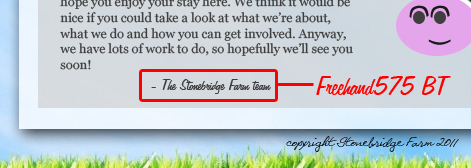
    As far as fonts go, I've stuck to 'Georgia' as it is easily readable and comes as standard on windows computers, I also think it adds extra depth to the design. Verdana is usually too wide and trebuchet is usually used quite often. Helvetica is over-used and not to mention not everyone has it. Georgia ticks all the boxes. It's easy to read, looks good, most computers have it and it causes the least amount of problems in terms of formatting. I have used a custom font for the 'Welcome!', 'Latest New' and 'Recent Events' headers, but this can easily be combatted as I can simply make them images, the same applies for the navbar (Font name can be seen above which was used briefly in one of my later ideas, I thought it looked nice so I decided to experiment and it worked. The handwritten effect gives a more personal feel in my eyes). The fonts I used for the navbar was similar to one I used in a previous design however in used elongated descenders on some of the glyphs(see below), which I didn't feel worked well with the rest of my developed design. So I chose a similar looking font minus the italics and the aforementioned elongated glyphs, and so Aardvark Cafe became Elegance. 


    Finally, I've also taken the idea of creating 'boxes' that feature a stripped down version of the site's content and are clickable to the appropriate page. This idea was taken from the idea above, however given the available space I couldn't incorporate the drop down description. Although perhaps I could make it so that when it is hovered over, the other boxes become transparent and the selected box expand for a brief description. I'd like to include this as it would be a nice flash element to the website. Two other things I took from my ideas was the continuation of featuring the 'latest news' element on the home page and the small header and site name, which I first used in the idea below.


    Overall I am happy with how my design has come out. It may not look as professional as some websites out there but I believe it is infinitely better than the current website that is currently being used, and therefore is an improvement. I am aware that I will have to look in to php for things such as the rss feed and the new updates...although this is very simple stuff once I can get a grasp on it. Depending on how much time I have I may include the function to sign up for a newsletter. Although we will have to wait and see


    Sunday, 13 February 2011

    Most commonly used colours

    I created a graph in Photoshop (no, I don't have excel) to show the most commonly used colours of websites that fall under City Farm when searched on Google. The results weren't surprising, although I have taken note that I thought yellow would be there, and no websites used it, on the otherhand I was surprised orange even came up. The only site that used it had large orange text as it's header and it should be noted that the same site that used orange was also the same site that used red.

    I found that the most common two colours (especially in conjunction with eachother), were green and white. I knew it was a popular choice, but the majority of websites were either completely green or green with a white background for the text. This tells me that if I make a green and white website, it will look like every other website, which is not what I want. If my design looks the same as every city farm site then what impression will people be left with and would they be more likely to show more interest? Doubtful. Of course I'm not going to single out these colours completely, it's obvious they're popular for a reason, but as long as I'm aware that if I use these colours, I have to come up with something really special in the layout or the way the content is organised.

     Black was also present but not as a dominant colour, for example the text  or the navbar would be black.

    Tuesday, 8 February 2011

    Website Research

    Introduction

    I feel that if I don't do some type of research, that my designs will suffer in several areas. By research, I mean looking at and evaluating current or similar websites to the one that I'm designing for. This includes looking at:
    • Commonly used colour schemes
    • The type of content appropriate for a city farm website
    • Layout style - Is it open, sectioned, artistic?
    • Use of typography
    • Site features - Increase/decrease type size, flash, change layout colours?
    By looking at these things, it will help me create a website that put a focus on the user as opposed to what I think is necessary. What I mean is, by examining and analysing I can gain some insight in to the designers thought process and therefore develop my own thought process while I construct ideas, therefore (hopefully) making me a better designer and a better site for the user.

    Current Websites

    To start, I simply typed in to google 'City Farm' and viewed some of the results on the first page, as they would be the most relevant. 


    Looking at the description that google gives me, I can immediately see that a lot of the blurbs include the words 'Educational', 'Recreational', 'local' and 'family'. Already I can see that a corporate looking website probably isn't what the farm would be looking for, but that's obvious. What those words do tell me however is that the site shouldn't take itself too seriously, indicating that any graphics art I might incorporate shouldn't be too polished, as this will imply a professional standard. It also tell me that the colour scheme should use bright colours and use of darker ones should be minimal, for obvious reasons. Basically, when visiting the site the user must not feel as though they've stepped in to an office or feel as though they are being communicated with in a formal manner. 

    First website - Hackney City Farm - www.hackneycityfarm.co.uk


    As you can see from the screenshot, it's not the most aesthetically brilliant thing you've ever seen, although it does the job. The website follows a conventional layout, featuring the navbar down the left hand side and the content in the centre. One thing I did notice that is missing from my designs is the Opening time are displayed on the homepage, as well as some shortened text describing the contents of the site under the 'Find out more about' and 'Courses & Workshops'. 

    This is something that I feel I should include in my own designs as it saves the page from being overly spacious. It also enhances the users experience as everything they need is more or less on the homepage. Additionally, the manner of the text isn't formal but it isn't too informal, providing a nice balance. Something I should take in to consideration while I'm inputting content. 

    Finally, the background and the colour scheme relate well, although not being outstanding in their appearance. The whole site has a little bit of a dated feel that I would like to avoid. Personally I think this is down to the fonts used for the navbar and site header. The fonts used for the content work well but I feel clash with the sans-serif typefaces used. Furthermore, primary use of the colour brown doesn't help the dowdy feel the website has. Something that I've noticed about a lot of these types of website, is the use of green and unfortunately brown as well, which I think is only effective if used correctly. 

    Second Website - Kentish Town City Farm - www.ktcityfarm.org.uk


    As similar story to the Hackney City Farm website, the website doesn't exactly tick all the boxes in the appearance section. Also, the use of green is present  but not as prevalent as the previous website I looked at. What can really be said? Anything good about this website, i've already said about the Hackney City farm because the layout and presentation is very similar. One thing that I will say about this website is that it's rather boring, the lack of colour and visually uncharacteristic layout don't do it any favours, although that aids functionality while sacrificing appearance. Which I suppose isn't all bad, as I would prefer a website that is usable, over a website that is impossible to navigate but looks pretty. 

    Despite that, I think I could do better than this. It's quite unimaginative and a little bit dire, not a website that I would detest using, but not one I would enjoy. 

    Third Website - Deen City Farm - www.deencityfarm.co.uk


    Finally, a website that looks a little bit more up-to-date and current. This actually looks like it was made by a web designer as opposed to the employees of the farm itself. 

    I like the way it's been laid out, with all the content in the centre and a nice amount of spacing in between each element which gives the content an un-crowded and presentable feel. I noticed that the home page features a small introduction to the site, which is good for me because that's what I initially intended for my own designs. Similar to the first website I analysed, there is a news section to the right of the content, although this time, because the page layout is more vertical, there is also a recent images element, newsletter element and some input boxes to sign up for the newsletter. While there is all this extra content, the page doesn't look crowded. 

    The simple addition of a solid coloured background works well, although the lack of graphics makes the website look a little more generic than you would initially think when you first look at. I do think that the header and the fonts used could have been a little bit more creative, although I think that in the site's header's case, that was the choice of the farm rather than the designer. I say this because it's a relatively low resolution and doesn't fit with the rest of the website.

    That being said this is probably the best website I've seen for a city farm, most of them are generally pretty...well general. Rather un-memorable design, with nothing that seperates them from other websites. Although, it's understandable as a farm website isn't exactly the highest priority on the list. I think most of the websites I've looked at have been designed for functionality as opposed to being made to promote the farm. But why not? Surely there's nothing wrong with gaining exposure as it would only generate more interest and make the name more well known. Whatever the reason, I believe that above all else, functionality is the top priority and therefore I should design around specific features, instead of designing the appearance first and cramming the features in around the design. 

    Gantt Chart


    I've allowed myself more time with the flash elements (or other forms of coding besides css/html) because I know that I will more than likely struggle the most with that area. 

    Friday, 4 February 2011

    2 more ideas


    I've decided that one thing my websites have severely lacked in the past, has been the prescence of a graphics design piece to accompany the design. While my current ideas don't exactly rely on this aspect, I feel that I could benefit greatly from incorporating it in to my work. I like the idea that the navbar and the image have been combined to make one element, this allows room for more detailed/larger graphics design. This is a homepage that is purely functional. It's got the two things a homepage needs, a welcome paragraph and the news feed. I wouldn't like to add anymore text, although I believe I could have done something more with the bottom half of the page.

    As you can see from my last two designs I've tried to use a different approach in terms of the amount of variety my designs possess. Personally I think it's working, however basic. Additionally, I've also tried to keep a wide element spanning the width of the page, to give each page a definable structure. I've also designed with flash i mind, as the boxes below the "Welcome and a big thank you for visiting" will drop down to display their contents, of course they will be click-able. With the second idea, I struggled for ideas to incorporate a graphics art piece. Although I don't think it necessarily needs it as the boxes need space to expand in to, however I think that when nothing is selected the page will look rather bland. One more thing, I've made the text more informal, because formality is something that I consider to be of a more professional characteristic, something which I associate with large companies, which of course the farm is not.

    Wednesday, 2 February 2011

    Two New Ideas + Older Ideas

      Here are the designs I submitted as part of my project proposal. I've excluded one of the design because it simply isn't good enough. In fact, I'm rather disapointed in myself that I even decided to make it. It's that bad. Anyway, here they are.

    I think could be a potential base design for the final website. It's pretty simple at the moment, which is why I should evaluate it and develop it. I do however like the element of simplicity, although the homepage doesn't do what a homepage should do. It doesn't give a quick over of the website (the latest news, events and happenings at the farm) which I think is important not only because it's useful, but because it also makes the page more interested. There is a difference between beautiful simplicity and a design being outright boring. I think this is leaning slightly towards the latter, although there are definitely positives that I can take from this design.

    While I really like the idea behind this design, and I mean really like it, I don't think it would appeal to the target audience that the farm attracts, which is mainly families. This style would be more suited to a record labels website or something along those lines. I do like how the elements on the homepage are clearly segregated, which makes for easy viewing at first glance. I also really like the colour scheme, green relating to  the farm aspect, and the dark grey reflecting the farm's location. The white merely being used as a neutral contrast for the text.
    I think this deisgn is borderline, maybe with some tweaking it could definitely be a contender for the final design, although I think it maybe looks a little bit too crowded and edgy for a farm website, city or not. Despite this I like the layout, especially the ''RSPB Big Garden Birdwatch' section to the right. I just had trouble finding something to put next to it that wouldn't look out of place and I don't think that I fully achieved that. Perhaps some sort of graphics could go there, such as a logo or a mission statement from the owners? As for it being too crowded, I can easily fix that by playing around with the font sizes and positioning, as I left ample space either side of the main body which I can use to my advantage to try and make the design fractionally more proportioned.

    Probably my favourite design so far, I think I've achieved a nice balance between professional and fun. I especially like the cow. That being said, the background isn't mine, so I wouldn't be able to use it in my final design without giving credit, and I don't know who the original author is. I can however take a similar photo myself when the weather allows me. I've also encorporated a slider at the top of the navbar, which will move whenever you click on one of the links, as i've been told I should try to use more complicated design aspects. While not useful, I think it would add to the overall worth of the site. Again, I like the colour scheme, it's 100% easy on the eye and not difficult to read. The layout is also nicely proportioned and doesn't look a shambles.

    I tried a bit more with my last two designs, because frankly I'm fed up of designing extremely similar websites and would like to push my creative boundaries. I also have some research that I need to upload to explain the choices I've made, although I probably won't do that until tomorrow.

    Monday, 31 January 2011

    Client Project Wireframes

    I was pretty sure I'd already posted these, but I must have been wrong. Anyway, here are the 6 wireframes I produced as a rough idea for the template of the website.


    I've tried to do something a little different with these, while they do help sometimes I think of a better layout while I'm making the mock design instead. Don't be surprised if you see the final design resembling something completely different to any of these. A lot of these also require some form of graphics in the background of thee header, which I will have to draw up some ideas for as well researching existing websites that pull it off well.