Thursday, 31 March 2011

Everitt Regular V3 -

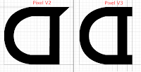
Below are the edited version of Pixel V2, the second of my artefacts. Specifically, this is the sans-serif version of the font. I believe that this counts as one of my my artefacts, however this isn't the finished version.

I have made a few changes from Pixel V2, which I'll address now.

The first change I made was to remove the serifs that I had used in the previous version. These can be found in my older blog posts on letters such as a, b, d, g, etc. I was told by shaun to remove these as they are not consistent enough with the rest of the font. This was evident as some letters did not feature these additional serifs. Because of this removal I had to make some changes to the characters themselves, and re-design some of them, these can be seen below. I have not included them all, as there are around 18 glyphs that differ from the original. However these are the most notable.


I would like to explain that the grid is a different size because some of the originals weren't re-sized when they were made. However the x-height has not been adjusted for any of the characters. 
The majority of changes that I made were removing the serifs off the edges of the characters, to give them a more rounded appearance that was consistent with the overall style of the font. Other changes I made included:
  • Some characters width being reduced. I decided that while keeping the curves constant, it was completely neccessary to have the same 'run-up' to the curve. Addtionally, by making them more squashed it meant that taller characters weren't so out of place alongside the wider ones. 
  • The angle of curvature reduced/increased. Examples of this can be seen on the u above, where the inital curve takes a much wider angle as opposed to its predeccesor. I did this so that the changes I made to the shape helped the overall aesthetic of character remain consistent with the rest of the font. Other examples can be seen on the m and n characters. 
  • Made the Upper-case more consistent in terms of how they relate to the lower-case character's x-height. For example, any horizontal lines that are used in the upper-case now sit directly above the x-height for all characters.
These are the changes I have made to the majority of characters, however there are still changes that I need to make in relation to the upper-case, explained below.

There are a few problems that I have noted while testing this from my own computer, mainly with the Upper-case glyphs. I believe that for the most part, the upper-case is the right height, but maybe could benefit if some of the characters were a smaller width. Additionally, I believe some characters will need to be completely re-designed in order to fit with the rest of the font in terms of how they are styled. Characters such as the upper-case N and M, do not fit with the way the rest of the font looks. They are too jagged and harsh, they do not fit with the rounded style of the font.

As you can see, below I have screenshots of what the font looks like when in size 10 and size 20. Some characters are too wide or too squashed. This is mainly evident within the lower-case.


I believe that this version of the font is an improvement on the last version, at smaller sizes the font looks readable, despite the inconsistencies between the appearance of upper-case and lower-case characters. I will update once I have re-designed and implemented these changes.
Monday, 28 March 2011

Artefact 2 – Evaluation

I believe my second artefact was an improvement on the first. This was reflected in the feedback I gained from Shaun, who expressed the same sort of feelings towards the font that I had. That my second font was much more attractive/readable than the first.

I believe that my second font was an improvement as it was much more applicable to a wider range of uses. This was something Shaun also expressed, as the rounded nature meant that the font was more aesthetically viable for public use. There are improvements that I can make however. For example, learning how to properly kern my font as well as not mixing sans-serif with serif, which was also feedback given to me.

The process was effectively the same as my first font, however I was aware I didn't have to outline my final sketches in great detail, or outline them in black ink (as to stand out when scanned in).

It's not what I completely expected, although the general feel of what I was trying to achieve is there. A rounded and wide font. I will have to re-design some of the letters as at smaller sizes it appears as though some characters are a different height, when in reality they are exactly the same. The font works, although lacks some characters such as numerals and punctuation.

While the process was lengthy, it is the only process that is viable (as far as I'm aware). However, this isn't a significant problem as the majority of time spent on my first font was dramatically reduced for my second because I knew the process.

In conclusion, I think my font still needs work, but it is slowly taking shape through my own development.


Saturday, 12 March 2011


Few changes from the first version, I've tried to keep the stroke thickness the same throughout the entire font. I've also included the punctuation glyphs. 

This time around, I've decided to try and imagine what this font would look like on a computer screen. I think some of the characters need some work, for example the w is probably too wide, most notably the capital W. 

I've also tried to keep things consistent, and some capital letters mimic the lower-case, rather than having a different style. Looking at my font as a whole, I think it would be better if I didn't include the little flicks (usually to the top left of the letter, see J, R, M, P and N). Mainly because a lot of the lowe-case letters have these flicks, yet their capital counter-parts do not. Therefore I think it would be more consistent if I removed the flicks from the capitals entirely, as it's only the minority that have them. I learnt my lesson this time and these only took collectively about 3 hours (I have to draw in pencil and then draw around the outline in pen so the lines are visible), leaving me more time to do the blown up versions. Which i think will be useful as my last font, I used those drawings as a reference point.

Wednesday, 9 March 2011

Everitt Pixel Regular is born - first font done

First aretfact is now done, before i do my evaluation, I should explain what happened between scanning the images in and being ready to import in to fontlab. 


As with all things when you start out with something new, you make time-consuming mistakes just down to inexperience. Such things have happened to me in the past 5 days. For example, it wasn't completely neccessary to draw each letter out by hand on a landscape piece of a4 beforehand. While they did act as a good reference point if I lost my way, the I could always look back and confirm anything i needed. 


As good as that is, I think next time I will spend less time on the drawings and depending on time, maybe not do them at all, as everything can be drawn in Illustrator and the path imported in to FontLab. Mainly because the a4 drawings are too large when they're scanned in to and subsequently take time to resize. I had to re-size every single character individually because of my error. They then need to be re-scaled with Fontlab in mind as some simple maths came in useful when calculating from points/millimeters to UPM (Unit Per Metre), which is the unit fontlab calculates size in. 


This required finding the em square of my font (ascender height + descender height). Initially I thought that the ascender is usually the same height or taller than the caps, but with my font the ascender was lower, which caused some confusion as I wasn't sure if I should use the caps height for em square as it is the tallest value. This is the maths that makes sure the font is the right size when it's finally generated. 

After resizing the characters so they are all in proportion, it's a case of copy and pasting the shapes from Illustrator to photoshop. No .eps file required, which I thought would be the case, but apparently not. 

Once the images are in Fontlab (and after altering the caps height, ascender height, x-height, and descender height in the options), all that has to be done is lining up the paths with the guides and setting the spacing bewteen each letter. However I was disapointed to find that I could only export in TrueType instead of my personal preference OpenType. 


Evaluation

Artefact 1 Evaluation – Daniel Everitt


Why did I chose the ideas that I did to make a font? They seemed like the easiest in terms of measuring things out, I didn't want to over-stretch myself with a font that was to difficult to produce.
One thing I believe would've enhanced my font, would be to make every stroke the same thickness. I used straight flat edges and differing measurements for stroke thickness. Different thickness’s could have been useful in a fluid font, but not for such a linear one. Because of this, you can pick out the varying strokes at small sizes, making my font clunky.


Another mistake I made, was neglecting using diagonal strokes, instead of purely horizontal and vertical strokes. You can see the difference between the capital V and the B. Next time I should try to visualize how the letter may look when they are decreased in size, and design accordingly.


I should have used more flexible letter widths. While I think this was partly a good decision for letters like m & w, it also meant that some characters are negatively effected by it like the c, a, y and z. Next time I should research in to character widths and find out if there are equations that would calculate the appropriate width. Failing that, do what looks good.


I also miscalculated the x-height of the i & j characters. The top of the stems should be level with each other. The descender looks squashed, which might indicate wrong measurements.


Next time, I will know that my measurements must be finer, and the decisions I make must consider the overall aesthetic of the font, I think that this time around I was focused on the wrong things, and therefore neglected the basic essentials.


Monday, 7 March 2011

Scanned in drafts + Illustrator + Changes

So I've scanned in the entirety of Pixel, a-z & A-Z, and also touched up the images so they're not as noisy. 

After scanning them in, I opened the jpeg files up in photoshop, as the scanner did not give me the option to scan in bitmap format (although it allowed me to scan it in purely black & white), and ironed out any rough edges, although I didn't spend too long doing this as each drawing is only being used as a guidline. 

Additionally, I did try drawing over the scanned in lines with the line tool, and while this worked really well, all in all it wasn't beneficial enough for the amount of time that was consumed doing it.  So instead I erased any over-lapping lines and rough edges.


After smoothing out the letterforms, I re-sized them to a width of 1500px. In hindsight, this probably wasn't the best idea. It doesn't save me any time, nor is it an accurate way of getting everything the same size,b in fact it's probably detrimental to the entire process as not only have I spent time re-sizing them and saving them, I also have to re-size the image in Illustrator so it is the same size as everything else.


I've started doing some work in Illustrator, I've had some problems with it. First of all, I can't find out how to cut a shape out of an existing shape. So for example letters like b, o, and a, this has been a problem. I've gotten around it, but I'm not sure if the method I've used will work. Currently I've drawn the initial shape and then drawn the shape that I want to cut out, on top of the initial shape. I predict that when I finally import the shae into fontlab, it's going to cause problems if I leave it the way it is. 


Additionally I've also made some changes to some of the letter. Specifically the i and the j. When zoomed out, these characters looked out of place, so I looked at the x-height and the ascender height and then top of the stem was a different height to the x-height and was way too close to the ascender height. Basically hanging around in no-mans land. So I lowered the stem, changed the k accordingly and also documented the new sizes so that i can make subsequent changes to all the other lower-case characters.

Finally I've also managed to install the full copy of fontlab and illustrator, I need to find out how to import the shapes I draw, into font lab. The thing that is taking up the majority of my time is learning new processes and figuring out solutions to any problems I can encounter. Currently trying to find out how to import correctly into fontlab using .eps files instead of simply copy and pasting from Illustrator.


Saturday, 5 March 2011

Final Draft of Pixel

 I've drawn up the basic character set for Pixel. Upper-case and lower-case are both done.


Obviously this isn't all of it, here's some pictures of a few of the sheets, I just didn't want to upload about 20 images of basically the same thing. 

I have to now have to scan it into a computer in bitmap format, import through photoshop and iron out any rough edges. This includes removing the pencilled in guidline I drew for a more accurate representation of my draft copies. After that it's a case of importing it in to Illustrator a vectorizing it and then also importing it in to whatever fontsoftware I can find. Before I can conduct research in to how effective my font is, I first have to make it so It can be printed on paper, rather than the subjects evaluate the font in it's unfinished form. That to me would result in innaccurate results.

Hoping to get some results by monday at the earliest. Depending how difficult fontlab is to use, earliest time I can expect to have a font usable on a computer is by Monday.


Thursday, 3 March 2011

Upper case drafts


Upper-case drafts for regular and pixel.

I've decided against doing an Upper-case for the 'gothic' version. My reasons being that drawing them out by hand simply takes up too much time, more so with the gothic version as it is less conventional, it therefore takes more time to make the letters look right, and make them appear as though they should be of the same font. If that makes any sense. As for numerics, I'll draw those up once I have the these three fonts done with the letters, as they are not an essential part of the font. Same applies for grammar.

I think both of these turned out well, especially the pixel upper-case. Although that is expected, as not much can go wrong with those straight edges. This is the only font that I wouldn't change anything from my initial ideas. I think they all fit well together and the spacing is just about right for the effect that I wanted to achieve. Which was a tall font that appeared as though it had been drawn out by hand, despite it's square appearance.

As for the regular upper-case, I may have to tweak some of the characters, for example the K is looking a little bit wonky and the Q looks slightly out of place. Other than that the only thing I am considering changing is the overal width of the characters as I am happy with the height and spacing.

Tuesday, 1 March 2011

Third Font Draft


These take longer than I initially anticipated. Uppercase coming soon. 


This was a more difficult font to fully realize, which I still don't think I've accomplished. Definitely needs development particularly on the following characters, which I think are a bit sketchy. No pun intended. 


  • c, e, g, o, x, y, w
These were the characters that I had the most trouble with, especially the c, since a and b have straight edges, I tried to incorporate that in to the c glyph, with little success. (See Below)
Above: Trying to draw the letter c in keeping with the rest of the font

I do like this font, and I think that it is readable, although that being said I have no idea what it looks like when at a smaller size. But currently I think it could at least be used, possibly, for larger scale work. I've tried to create my own version of a modern day Gothic font. While not being too old-fashioned and making some letters look almost completely different to their Roman counter-parts, I've tried to keep some resemblance. 

Another thing that may need change is the descender height. Mainly to contrast with the high ascender's but also because the elongated letters look not out of place, but just wrong. The J for example is far too elongated than is necessary and would look a lot better if it was shorter. I want to emphasize height with this font as I think that attribute lends itself to achieving an elegant font.

Finally, I would too add that I think it's important to keep an element of hidden consistency when designing a font such as this, while each character may be vastly different, there are key give-aways that link the characters together and make them look as though they belong in a set. This idea needs tweaking and development before that happens in my opinion, although we'll see what sort of feedback is given.